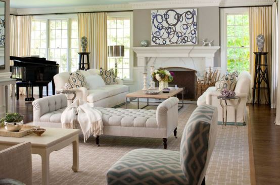
The desire to come home and slow down from a hectic environment has become the focus of many. It is because of this, that interior design has changed over the years to meet the needs of hard-working people to create a retreat that is all about cosiness.
As we all know, colour has a lot of power and new shades can transform a home fast and fabulous. Not only wall colour can add some personality to a room, for a relatively small investment new furniture can easily change the style and atmosphere in a home. When it comes to colour palettes, the latest trend is all about slowing down using softer shades to give a relaxed and warm feel to the spaces lived in. Compared to last year’s palette, the colours are a little less intense with pink tones still on the rise as well as earthy hues and greys in various shades. In 2018 neutral colours are no longer eggshell and white, this year’s palette includes greys and soft pastes such as pinks, greens and blues to use in furniture and accent pieces.
If you are nervous about introducing a new colour to your home, start by adding small details such as the blue Archy lounge chair with its sophisticated design or add two Flora seats as their elegant wooden feet and timeless grey will compliment any library or lounge.
On the assumption that you are brave enough to add some colour to your home, think about the look and mood you want to create first. Deeper and brighter colours will balance out muted hues while deep shades work well with greys and a fresh white pairs best with brighter hues this season. We have put together a few tips for you how to work the latest colour palettes within your four walls.
The manly Bohemian
The Bohemian look with a masculine touch is the easiest and cheapest one for us Australians to rock as many are already going all white at home. To give the bright monochrome palette a new look, simply add wood or metal furniture for a more industrial feel. Combined with geometric accents in cushions on an Italian leather chair, this look is always a winner.
The Aussie trend
The all-Australian interior trend holds a colour palette straight from the bush with its muddy greens and terracotta tones. Grey can be used as a base tone if olive green seems too strong. For this look, the furniture should be of wooden material with clean lines and soft textures and the décor handmade for a rustic vibe. Native flowers will complete the endemic look and palette.
The romantic scheme
To celebrate the feminine look, a darker colour palette is in trend this season, which can not only be featured in furniture but wall paint and paper. Walls will be painted in black, burgundy or dark grey. Floral artwork can be seen throughout the home and brass for a feminine and luxurious feel. A button-trimmed dresser or tufted headboard completes this design trend.
Minimal calm
For those who are craving a haven of silence to retreat to when at home, this design trend might be for you. The approach is more about texture than colour, the palette still neutral with muddy greens and blues and greys mixing with sandy tones. Furniture design should have clean lines and be of wooden material with the stitching still visible for a craftsman touch. As this look is for minimalists, clutter should be avoided for the home to appear airy and bright.
Terracotta simplicity
Terracotta hues have greatly influenced new trends lately. Not only has the Nordic style called Hygge picked up on earthy and mineral tones including clay and ore, but this colour palette also invites to focus on the simple things in life. While more and more consumers wonder where their food comes from and we see a lot of homegrown produce on our plates lately, this colour palette is all about organic shades.
Complimenting pink
For their tranquillity and subtle warmth, pink tones schemed with grey shades for perfect balance are becoming more and more popular in interior design. Neutral pink hues create a confident colour scheme that is full of personality. This season’s coral pink can be seen in a lot of living rooms and kitchens lately and works well with aqua or pistachio.
Read Also:
